What is Graphviz?
Graphviz (Graph Visualization Software) is a powerful open-source tool developed by AT&T Labs that lets you describe graphs and diagrams using a simple text-based language called DOT. Instead of dragging boxes around in a GUI, you write code — and Graphviz handles the layout automatically.
It’s perfect for:
- System and software architecture diagrams
- Data pipeline flows
- Dependency graphs and trees
- Network topology maps
- Entity-Relationship (ER) diagrams
- CI/CD workflow charts
Installing Graphviz on Linux
Ubuntu / Debian
sudo apt-get update
sudo apt-get install -y graphviz
CentOS / RHEL / Fedora
# Fedora
sudo dnf install graphviz

# CentOS/RHEL
sudo yum install graphviz
Verify Installation
dot -VExpected output:
dot - graphviz version 2.43.0 (0)Understanding the Layout Engines
Graphviz ships with multiple rendering engines — each suited to different diagram types:
| Engine | Command | Best For |
|---|---|---|
| Hierarchical | dot | Pipelines, trees, DAGs, flowcharts |
| Spring model | neato | Network graphs, small force-directed |
| Force-directed | fdp | Large undirected graphs |
| Scalable force | sfdp | Very large graphs |
| Radial | twopi | Tree-like radial layouts |
| Circular | circo | Cyclic structures, rings |
For data pipelines and architecture diagrams, dot (with rankdir=LR) is almost always the right choice.
Your First Graph — Hello World
Create a file called hello.dot:
digraph HelloWorld {
    rankdir=LR;
    A [label="Start"];
    B [label="Process"];
    C [label="End"];

    A -> B -> C;
}
Render it to PNG:
dot -Tpng hello.dot -o hello.pngOpen the image — you’ll see three boxes connected left-to-right. That’s your first Graphviz diagram.
Common Output Formats
# PNG image (most common)
dot -Tpng diagram.dot -o diagram.png

# SVG (scalable, great for web/blog embedding)
dot -Tsvg diagram.dot -o diagram.svg

# PDF (for documents)
dot -Tpdf diagram.dot -o diagram.pdf

# List all supported formats
dot -Thelp 2>&1 | head -20
Real-World Example: Medallion Architecture Data Pipeline
The Medallion Architecture is a modern data engineering pattern (popularised by Databricks) that organises data into three progressive quality layers:
- 🥉 Bronze — Raw, unprocessed data exactly as it arrives from source systems
- 🥈 Silver — Cleansed, validated, deduplicated, and enriched data
- 🥇 Gold — Aggregated, business-ready data optimised for analytics and ML
Here’s the full pipeline diagram generated with Graphviz:
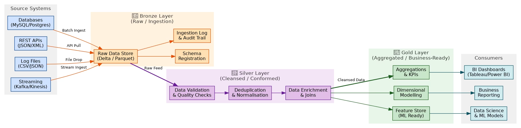
The DOT Source Code
Save this as medallion_pipeline.dot:
digraph MedallionArchitecture {
    rankdir=LR;
    fontname="Helvetica";
    node [fontname="Helvetica", fontsize=12, style=filled, shape=box, rounded=true];
    edge [fontname="Helvetica", fontsize=10];

    // Source Systems
    subgraph cluster_sources {
        label="Source Systems";
        style=filled; color="#f0f0f0";

        S1 [label="Databases\n(MySQL/Postgres)", fillcolor="#cfe2ff", color="#084298"];
        S2 [label="REST APIs\n(JSON/XML)",       fillcolor="#cfe2ff", color="#084298"];
        S3 [label="Log Files\n(CSV/JSON)",        fillcolor="#cfe2ff", color="#084298"];
        S4 [label="Streaming\n(Kafka/Kinesis)",   fillcolor="#cfe2ff", color="#084298"];
    }

    // Bronze Layer
    subgraph cluster_bronze {
        label="Bronze Layer (Raw / Ingestion)";
        style=filled; color="#fff3e0";

        B1 [label="Raw Data Store\n(Delta / Parquet)", fillcolor="#ffe0b2", color="#e65100"];
        B2 [label="Schema Registration",                fillcolor="#ffe0b2", color="#e65100"];
        B3 [label="Ingestion Log & Audit Trail",        fillcolor="#ffe0b2", color="#e65100"];
    }

    // Silver Layer
    subgraph cluster_silver {
        label="Silver Layer (Cleansed / Conformed)";
        style=filled; color="#f3e5f5";

        SV1 [label="Data Validation\n& Quality Checks",  fillcolor="#e1bee7", color="#6a1b9a"];
        SV2 [label="Deduplication\n& Normalisation",     fillcolor="#e1bee7", color="#6a1b9a"];
        SV3 [label="Data Enrichment\n& Joins",           fillcolor="#e1bee7", color="#6a1b9a"];
    }

    // Gold Layer
    subgraph cluster_gold {
        label="Gold Layer (Aggregated / Business-Ready)";
        style=filled; color="#e8f5e9";

        G1 [label="Aggregations\n& KPIs",       fillcolor="#c8e6c9", color="#1b5e20"];
        G2 [label="Dimensional Modelling",       fillcolor="#c8e6c9", color="#1b5e20"];
        G3 [label="Feature Store\n(ML Ready)",  fillcolor="#c8e6c9", color="#1b5e20"];
    }

    // Consumers
    subgraph cluster_consumers {
        label="Consumers";
        style=filled; color="#f0f0f0";

        C1 [label="BI Dashboards\n(Tableau/Power BI)", fillcolor="#d1ecf1", color="#0c5460"];
        C2 [label="Data Science\n& ML Models",         fillcolor="#d1ecf1", color="#0c5460"];
        C3 [label="Business Reporting",                 fillcolor="#d1ecf1", color="#0c5460"];
    }

    // Edges
    S1 -> B1 [label="Batch Ingest"]; S2 -> B1 [label="API Pull"];
    S3 -> B1 [label="File Drop"];    S4 -> B1 [label="Stream Ingest"];
    B1 -> B2; B1 -> B3;
    B1 -> SV1 [label="Raw Feed", style=bold];
    SV1 -> SV2 -> SV3;
    SV3 -> G1 [label="Cleansed Data", style=bold];
    SV3 -> G2; SV3 -> G3;
    G1 -> C1; G2 -> C3; G3 -> C2;
}
Render it:
dot -Tpng medallion_pipeline.dot -o medallion_pipeline.pngBreaking Down the DOT Syntax
Graph Types
graph G { }        // Undirected graph (use -- for edges)
digraph G { }      // Directed graph (use -> for edges)
subgraph cluster_x { }  // Named subgroup (prefix must be "cluster_")
Node Attributes
node [shape=box, style=filled, fillcolor="#cfe2ff", color="#084298", fontname="Helvetica"];| Attribute | Values | Description |
|---|---|---|
shape | box, ellipse, diamond, circle, record | Node shape |
style | filled, dashed, dotted, rounded | Border/fill style |
fillcolor | hex or named colour | Background fill |
color | hex or named colour | Border colour |
fontname | Helvetica, Arial, Courier | Font family |
label | Any string | Display text (use \n for newline) |
Edge Attributes
A -> B [label="Data Flow", style=bold, color="#e65100", arrowhead=vee];Graph Direction
rankdir=LR;  // Left to Right (best for pipelines)
rankdir=TB;  // Top to Bottom (default, good for trees)
rankdir=RL;  // Right to Left
rankdir=BT;  // Bottom to Top
Useful Tips & Tricks
1. Force Node Ordering
{ rank=same; A; B; C; } // Place A, B, C on the same rank/level2. Invisible Edges for Layout Control
A -> B [style=invis]; // Hidden edge that still influences layout3. Cluster Subgraphs
Any subgraph with a name starting with cluster_ gets a bordered box:
subgraph cluster_backend {
    label="Backend Services";
    style=filled;
    color=lightgrey;
    API; DB; Cache;
}
4. HTML-like Labels for Rich Nodes
A [shape=none, label=<
    <TABLE BORDER="0" CELLBORDER="1" CELLSPACING="0">
        <TR><TD><B>User Service</B></TD></TR>
        <TR><TD>POST /login</TD></TR>
        <TR><TD>GET /profile</TD></TR>
    </TABLE>
>];
5. Batch Render Multiple Files
for f in *.dot; do
    dot -Tpng "$f" -o "${f%.dot}.png"
done
Quick Command Reference
# Basic render
dot -Tpng input.dot -o output.png

# Different layout engines
neato -Tsvg graph.dot -o graph.svg
fdp   -Tpng large_graph.dot -o large_graph.png
circo -Tpng ring.dot -o ring.png

# Set DPI for high-res output
dot -Tpng -Gdpi=300 diagram.dot -o diagram_hires.png

# Output to stdout (for piping)
dot -Tsvg diagram.dot | gzip > diagram.svg.gz

# Validate DOT syntax without rendering
dot -Tdot diagram.dot > /dev/null
When to Use Graphviz in Your Blog
If you write technical blogs, here’s a simple rule:
If you’re describing something with steps, connections, or hierarchy — draw it.
Use Graphviz when writing about:
- Data engineering pipelines (like this post)
- Microservices and API architecture
- Kubernetes cluster layouts
- CI/CD pipeline stages
- Database schema relationships
- State machines and workflows
- Dependency resolution (npm, pip, Maven)
- Network topology
The diagram becomes part of the content — readers grasp the structure instantly instead of parsing dense paragraphs.
Summary
Graphviz is one of the most underrated tools in a developer’s toolkit. Once you get comfortable with DOT syntax, you’ll reach for it every time you need to explain something structural. It’s:
- ✅ Free and open-source
- ✅ Version-controllable (plain text
.dotfiles) - ✅ Scriptable and automatable
- ✅ Produces clean, professional diagrams
- ✅ Runs entirely on your Linux machine — no cloud, no GUI required
Install it, learn the DOT basics, and start embedding diagrams in your technical writing. Your readers will thank you.